
And now for something a little different ...


Most of you know me through antiques, collecting and my non-fiction books, but for some time now I’ve also been quietly writing my first novel.
I'm delighted to finally introduce the first book in what I hope will become the Jupiter James Mysteries series.
If you've never read a cosy mystery before, think of it as a clever whodunnit with memorable characters, beautiful settings and an intriguing puzzle, rather than graphic violence or high-octane action.


This first mystery introduces antiques dealer and author Jupiter James. She owns an antiques shop in the historic English seaside town of Brackenmere and travels the world in search of unusual treasures. But after a prominent local man dies in circumstances that mirror an obscure murder method from the novel she’s writing, Jupiter is drawn into the police investigation as both a witness and a suspect. Determined to clear her name, Jupiter follows a trail through medieval manuscripts, hidden histories and centuries-old secrets, where the truth is far more complicated than anyone first imagined.
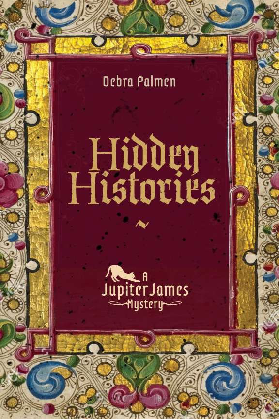
Because a gorgeous, illuminated medieval botanical manuscript is key to the plot, I've elected to mirror that in the front cover design. And that's the only spoiler you're getting!

If you enjoy the mysteries of Richard Osman, Robert Thorogood or Ian Moore, or love books, history, antiques and intelligent puzzles, I think you'll feel very much at home with Jupiter, her friends, and her little cat, Lucy, in Brackenmere.
Before publication, I'd love your help. I've attached several possible cover designs and would really appreciate your thoughts. Which one would make you stop scrolling? Which would you be most likely to pick up in a bookshop? Don't forget that elements can be mixed and matched too. For example, you might love the artwork from one version and the typography from another.
I'd love you to help choose the face of the very first Jupiter James mystery. Let me know what you think!


I like the use of gothic calligraphy for the font used on the cover. The gold leaf in the border really catches the eye, giving it a rich, illuminated look that really suits the medieval botanical theme. I would say keep the cat as well!